[Date Prev][Date Next] [Thread Prev][Thread Next] [Date Index] [Thread Index]

Re: New artwork proposal for Wheezy


Am 09.03.2012 um 23:08 schrieb Ben Finney:

What could help is to significantly reduce the contrast and colour
range.

Perhaps by using a simpler starfield and removing the starburst behind
the Debian logo. Or perhaps by filtering the whole picture through a
colour, similar to what was done for the Lisp Machine background.

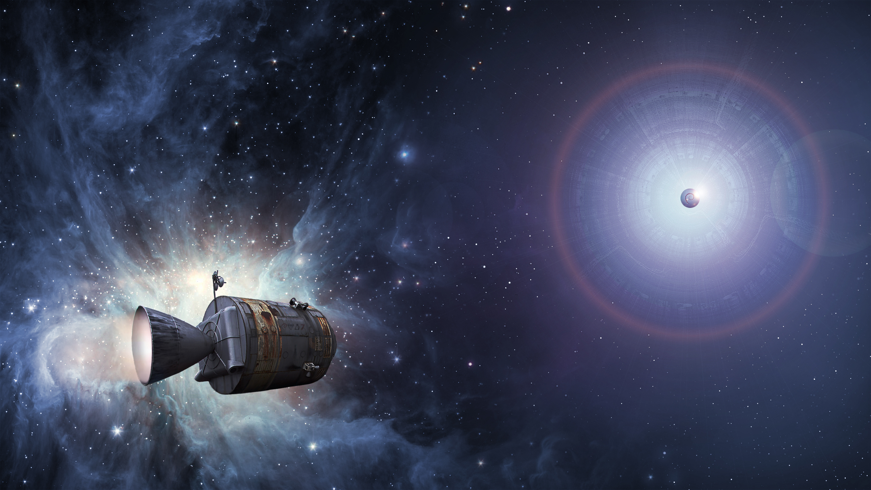
Hi Ben (again),

I have experimented a bit with it and could come up with something like this (sorry Onsemeliot):

http://lazybrowndog.net/debian/wheezy/_wallpaper/journey-screenshot-gnome-preview-v4.png

(and for your own testing: http://lazybrowndog.net/debian/wheezy/_wallpaper/journey-wallpaper-v4.jpg )

Is this even going into the right direction?

(Personally I think it's like black spiderman - looks elegant, but everybody likes the other one better.)

regards
Ulrich

Reply to: