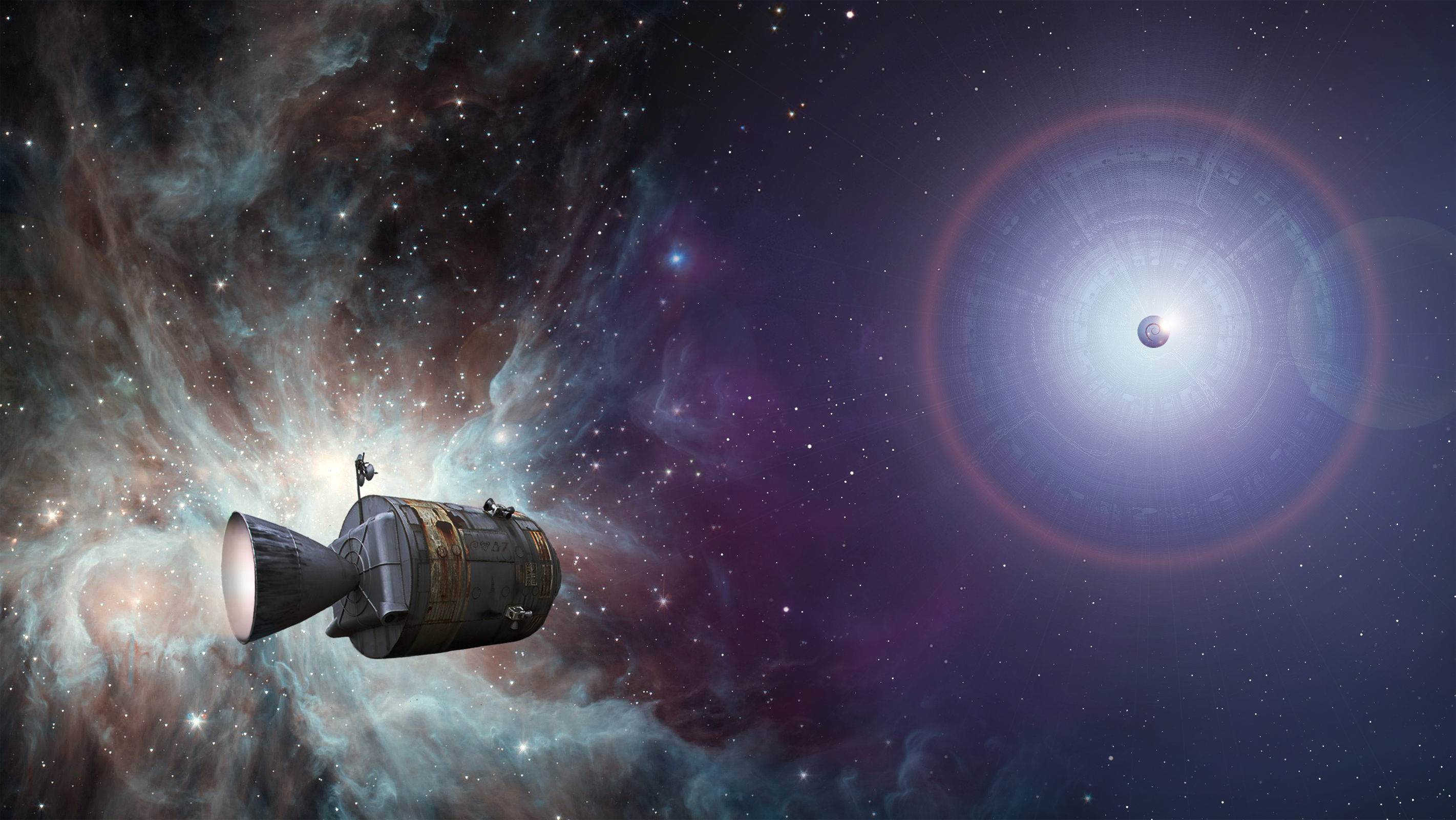
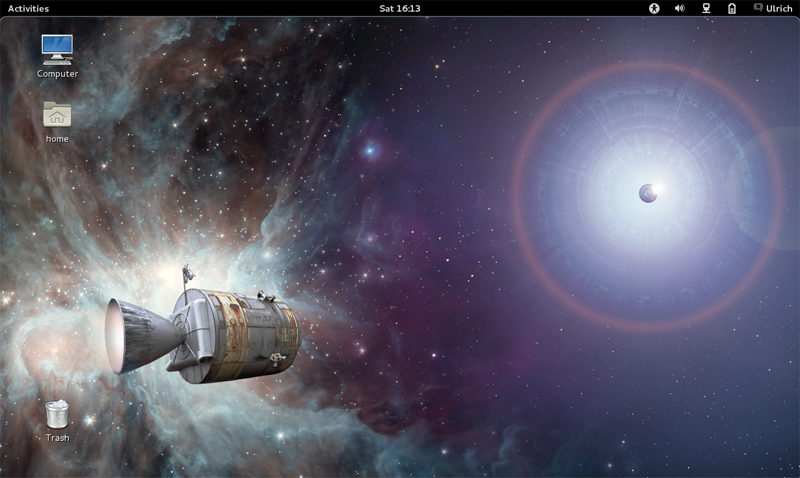
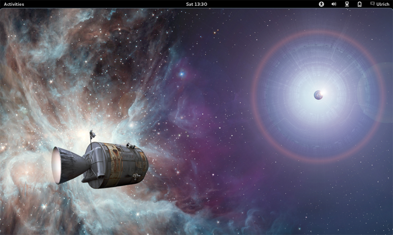
Am 09.03.2012 um 23:08 schrieb Ben Finney: Am 09.03.2012 um 09:21 schrieb Roman Khomasuridze: As of journey, I like the concept, but nebula and spacecraft part might be quite heavy on eyes, I agree with Roman. The picture is very good and nice to look at as a piece of art. But as a desktop background, it is too distracting: busy, high contrast, many colours. It jumps to the foreground! I added a soft shadow to the left half of the wallpaper. http://lazybrowndog.net/debian/wheezy/_wallpaper/journey-wallpaper-v2.jpg Does this work better for you? I don't see much of a difference, and the above points still apply. Perhaps this is more obvious: http://lazybrowndog.net/debian/wheezy/_wallpaper/journey-screenshot-gnome-preview-v3.png (new version) http://lazybrowndog.net/debian/wheezy/_wallpaper/journey-screenshot-gnome-preview-v1.png (original) The picture is now darker on the left side. The spacecraft is lighter, which reduces the contrast to the glow of the nebula. I am still convinced that the topic (space, stars) works great for the wallpaper. Many people use pictures like this one. Look at OS X with its beautiful Andromeda picture. And I think, the Orion nebula shouldn't look plain. We like it because it doesn't. But of course it is work in progress. :-) Thank you for making this beautiful piece, and working to fit it for the use case. Thanks for the feedback! regards Ulrich |