New website layout feedback
Hi,
What a great surprise I had when I entered debian.org today! :D
Thank you, the site looks great!
I just found two little glitches, or things that I think do not look too well:
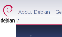
1. The header has a nice fade effect, but behind the Debian logo on the left, the background's fade effect is not the same and looks kind of "broken" as it is.
I think it would look nicer if the background behind the logo had the same fade colours as that of the central header (see attachments).
2. I saw that at the bottom of the page there is a "Report it!" button for website-related bug reports. When I clicked it, I was sent to a page that simply said: "Thank You / Thank you for supporting the Debian Website Team!".
I thought I was going to get a bug-report form or something like that. Then I noticed that I didn't have to click the "Report it!" button at all: this mailing list's address was there already at the bottom of the page. I suggest that either that "Report it!" button is removed or that a bug-report page raplaces that one that only says "Thank you!".
Thanks once again for the beautiful design,
Luís Picciochi
Attachment:
current.png
Description: PNG image
Attachment:
improved.png
Description: PNG image
Reply to: