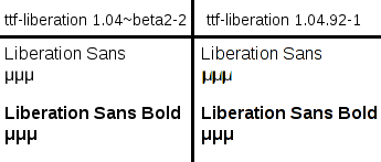
Hi Holger,
The screenshot you attached in your last message is exactly the way the
new liberation fonts (1.04.92-1) appear on my system. If you compare the
letter μ in liberation sans between versions 1.04~beta2-2 and 1.04.92-1
you will see that the new version is ugly (much more bold and it gets
thinner near the edges). Liberation sans bold (and other variants of
liberation) haven't changed between the two versions.

I am attaching a screenshot where you can better see the difference
between 1.04~beta2-2 and 1.04.92-1.
Attachment:
Screenshot.png
Description: PNG image